
Showing posts with label Art. Show all posts
Showing posts with label Art. Show all posts
Monday, 12 May 2014

Wednesday, 7 May 2014
The Koi

Perhaps it's their colours, their size or their anatomy. But something attracted me to them, something graceful.

I never thought much about them after the pet store closed down, nor did I know their name. Until I found the digital artist Yuumei (who has since won awards and the DeviantArt artist of the year award). She focused a lot on Koi's a lot, which symbol love and friendship in Japan.
The Koi is a coldwater fish that in winters hardly ever eats. It's variant colours have made them good for collecting and decoration in ponds. Many will pay large sums of money for one specially coloured Koi. Another special fact about a Koi that was 225 years old, which Koi's die around their 50's, owned by several owners. It goes by the name of Hanako.
The Koi has been selectivaly bred for a thousand years and thus created the goldfish. It was to small, lack of colour and different shaped to be called a Koi anymore. Plus the golfish can't breed with the Koi, as it now a different form of carp.
Tuesday, 6 May 2014
The Leviathan
Leviathan

This is my human version of the Leviathan. I'd add Japanese fish's fins to it but I think the simplicity stands out on it's own.
Progression of the Leviathan
This was a difficult process. Originally I was going to have hooks coming from the Leviathan woman with fish attached, but I couldn't find any secondary photo's on the internet suitable enough. So I changed my mind and decided to have these patterns shining light from her and changing her skin blue. Actually trying to transform her into a human Leviathan instead of just sharing my concept of one.
 Using the pen tool I put dots from her face down to her body. I put a light glow of yellow and added a lateral line which is what fish have to sense things in the water.


Mythical creature
Chimera
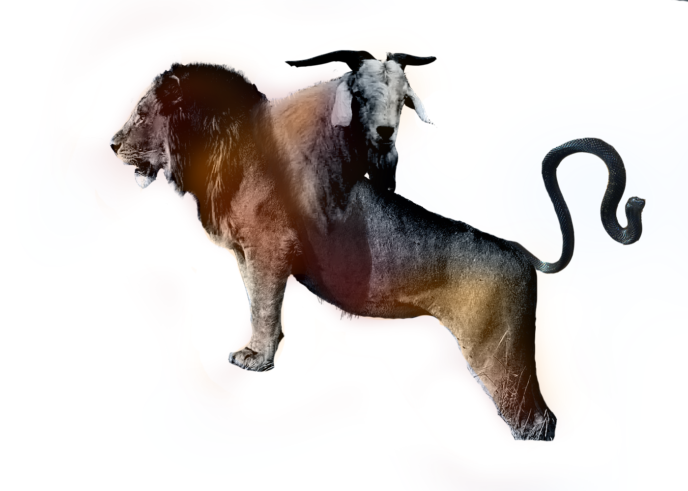
This was when I was still deciding what path to choose. I cut out a snake, lion and goat and merged them together like the Chimera. I grey scaled them to make the merging easier (which I could've done another way now) and then coloured it like I did with Mrs. Big Lipped.
Headless Horseman

It's all so copied and pasted. Nothing is alive or real here.
Monsters
Mrs. Big Lipped
This was my second creation. It's rather simple I created this. I enlarged my lips and used a black pen tool to create the eyes, then used my iris and enlarged them. Afterwards used the common trick of duplicating the picture and layering it transparent over the original. Then I added different colours and gaussian blur.
Zapper

The origin of this one is pretty funny though. I was on a skype call warping faces of Jim Carry and Nicolas cage. I tried to recreate my friends character and out popped this guy. At first we were laughing and then we realized this guy had a fantastic design!
It's called Zapper because the character it was based off was called Zap.
Wednesday, 30 April 2014
Skin and bones
Skin and bones
The original

I was just practicing morphing the face using the new skill I learnt; Layer Masking and Liquifying. I was watching a tutorial on how to morph an animal face into a person. I didn't like the results, so I looked for inspiration for my new techniques. I found a photo manipulated picture of a woman with a skull jaw, and the universe in her eye. It gave me inspiration. So I inked the red eyes, liquified the cheek bones like a skull and using the mask layer I applied a skulls teeth. This I think shows my improvement. It all looks very real and dynamic.
Filtered


Monday, 28 April 2014
DaDa Movement

DaDa emerged around 1916, born from the horrors of the first World War. They sought to unravel the war for what it is and what it had done using chaotic and random means. They also intended to rebel against other issues such as the traditional idea of art, the world war and bourgeois- communism.
It's unsure where Dadaism formed or where the idea came from but many believe it formed in Zurich and then spread to Berlin. A lot of dada artists moved to Switzerland for it's neutral attitude.
Hugo Ball recited the first manifesto and Tristan Tzara wrote the second manifesto which was and always will be one of the most important writings in history.
Marcel Duchamp wanted to prove that anything can be called art. Even writing a name on an urinal (not even his own name) could be art. It was sent to the Society of Indepedent artists but was rejected despite the fee that was payed. This became a popular photo and was regarded as the first ready-made art in creation. To be honest however he probably just didn't want to get caught so he wrote somebody else name on it.
"The artist is a not great creator—Duchamp went shopping at a plumbing store. The artwork is not a special object—it was mass-produced in a factory. The experience of art is not exciting and ennobling—at best it is puzzling and mostly leaves one with a sense of distaste. But over and above that, Duchamp did not select just any ready-made object to display. In selecting the urinal, his message was clear: Art is something you piss on." quoted by Stephen Hicks.
I've rewritten this several hundred times now. My mind always being swayed and changed. I've always been scared writing about this because I knew my mind would changed. I've got a lot to learn, and I'm still learning. At first I loved the idea of dadaism. Art can be almost anything, more than a painting. I fully agree with this.
However Dadaism is nothing more than punk. It set it mind on being crude, defiant and shocking with nothing more than rubbish. They sought to be intellectual beings, anarchists that would challenge the world to how different they were. Unfortunately there's a huge possibility that they were in it for the money. They'd preach about how it was to make a difference, or how writing a name on an urinal (which teens do every day) was art, but most of it was money lust.
The idea of ready mades that the manufactured object is art isn't hogwash. In fact it's pretty true. The assembly of a pen even can be seen as art. It's creation and use, who made it, is art. But to take credit with something as mediocre as writing somebody's name on an urinal, or drawing a mustache on the Mona Lisa is just silly. At least dadaism knew it was daft, but it wasn't in the good sense.
They say traditional art has no meaning, it was just for the rich. Honestly that's ridiculous. They probably just didn't look hard enough, but you'll see beautiful messages displayed. As my dad believes art is the artist conveying a message. It's like reading a novel or biography, only done with crafts and arts. An artist's interpretation and style is art, even if it doesn' look so appealing.
I like the idea of photo montage, cut and paste which is what I'm focusing on at the moment. It's fun creating and merging photo's together to create one. The same goes for collage, scavenging around for materials to use. It was indeed a clever idea for future methods in creating art. However a lot of people tend to only collage because it's easy; not to convey any message. I'll admit I haven't been thinking about symbolism and messages like I intended to. I'm just playing about, seeing what I can create. However my final piece will be full of symbolism, and will convey a certain message. Heck it will even relate to my interpretation on dadaism. I'll write about it another time however, once I've planned it all.
We get photos of women's bedrooms, the story being that she cheated on her husband and is thus 'art'. We have things like
Surrealism, Conceptual Art, Abstract Expressionism, Pop Art, and Post-Modernism as well as some political matters.
Wednesday, 23 April 2014
Fun
Railroad

This was just a random mess of madness. I tried to create a rail word face inspired by Moppaa's work (see bellow) but unfortunately this is just terrible. Yes it does look weird like the rest, but I clearly didn't know what I was doing. You can see my chin and the railroad was just a bit to clear. I think I could've added a bit more color to it at least.
Cartoon Me

Using a photograph I turned myself into a cartoon using the smudge tool, but leaving my top just the same. I also added a black line around it like cartoons. I'm pretty pleased with it but at the same time it just looked like a blurred out mess.
Potato Head

Now this one I really do like. My friends were mesmerized by this piece. I think the quality of the hands could've been better (I didn't know about the mask layer at the time) because they look rather cut and pasted. Despite this flaw the actual face, presentation and design is rather brilliant. It looks so real and disturbing. It is possibly one of the best I ever created but it isn't one of my personal favorites.
ONE

Now this was a piece I did for fun, and lead me to try more photo manipulated monsters with myself. This is a monster from Pan's Labyrinth. As soon as I saw this monster I fell in love with the concept. It was so imaginative and so creepy. So out of appreciation I manipulated myself to look like him. Despite not knowing the techniques I know now, this actually turned out really nice. Most of this was copying and pasting, then using a soft eraser to smooth it all in. I of course darkened the mouth as well. This is my first piece and still possibly one of my favorites.
Tuesday, 1 April 2014
Moppaa
I'm completely in love with this DeviantArt artists work and his illustrations for children horror stories. All I know is his job and that he lives in Russia. There is not biographical information on him as of yet but I still love his work. They usually feel like portraits, only disturbing and full of monsters.

He makes these from his own resources and then he manipulates them onto photoshop, creating the most disturbing work imaginable. I love the concept of this photograph. It reminds me of pollution, and perhaps the figure being death. It maybe seeing the whole city, everyone, as horrible people and sinners. I assume this because in the background there is a cross. He looks like he could be drooling a river or train rail lines from his mouth but it's rather unclear. The emotion I feel from this is pure hatred and disturbance. For his technique, I'm guessing he used greyscale (with a tint of color) and a photo of a city as well as a picture of enlarged teeth.
I'd love to pick out another photoshop image of his but I don't think I could. My brain is literally battling itself and screaming at the fact there's to many fantastic works to pick from and write about.
Link to his DeviantArt account http://moppaa.deviantart.com
Wednesday, 19 March 2014
Albert Fish

This may not look as pleasing as the rest of my pieces, but it was the one that inspired me the most. It gave me the idea to follow the route of Moppaa and photo manipulation. I love the unneat cut out head. It just gives it it's personality.
Wednesday, 26 February 2014
Hannah Höch

Hannah Höch was a Dada artist born in Germany, Gotha, November 1 1889 and died May 31 1978. She is regarded as one of the first photomontage artists. Photomontage are two photos or more joining together to create an unreal subject, a lot like today's Photoshopping.
Berlin Dada Movement
Dada means Yes Yes, which makes no sense. It literally means nothing.
 |
| L.H.O.O.Q. by Marcel Duchamp |
--Raoul Hausmann
'I wish to blur the firm boundaries which we self-certain people tend to delineate around all we can achieve.'
--Hannah Hoch
"We should burn all libraries and allow to remain only that which everyone knows by heart. A beautiful age of the legend would then begin."
--Kurt Schwitters'Art has nothing to do with taste. Art is not there to be tasted.'
 |
| Comparison of her work to Kurt Schwitters (Das Unbild) work, who as you can see follow a similar layout and colors. |
Hannah Höch
Her influence in the Berlin Dada movement I believe possibly came from Pablo Picasso, fellow Dada member Kurt Schwitters. Her work is quite similar with her compositions, dynamic and layered style. Hannah preferred metaphoric images then dirt, text based images like John Heartfield who she thought was quite tendentious with his work. She might have taken inspiration from her boyriend Raoul Hausmann, a fellow Dada artist who involved his poetic writing skills, photographs and anti-war beliefs into his work. Hannah Hoch, John Heartfield and Raoul Hausmann were key figures on this movement. There are many more figures as well but they will be my main focus. Hannah Höch was an accomplished feminist and the only German woman to participate in the Dada movement but she wasn't the only woman to work in Dada. She mainly critiqued the Weimar German Government.

Cut with the Kitchen Knife through the Beer-Belly of the Weimar Republic, 1919
Perhaps her most famous work. Here are cut and knife piece of politicians, women, technology, Dada typography and anti-war typography along with scenes of gatherings and riots. This obviously is a poster or piece to speak against the war and politicians. It's quite plain in other areas with colors of a dull blue and skin colour peach. However at the bottom it slowly becomes red, as to show danger and evil. She has also created some surreal scenes such as a politicians head on a female belly dancer, a man's head connected to a blimp, a soldier covering half of a politicians face and the letter "E" planted in the middle of marching soldiers.
Sexuality and Feminism
Feminism are a collection of ideologies and movements aimed at establishing and defending equal politics, economic and social rights for women.
She was a bisexual woman, once being in a 9 year relationship with a Dutch writer Mathilda (Til') Burgman, whom Höch met through friends Kurt and Helma Schiwitters. Her artwork often had usually depicted same sex couples, both men and women. Her artwork depicting them may have been related to her sexuality and promotion of homosexuals and bisexuals alike. However she especially promoted the equality of women, as she is a feminist.

Hoch's collage here mixes both women and mechanical objects. I believe this this represents the comparison of women to objects at the time. Working like the way objects do with how they are efficient, without a brain or opinion and unable to question their role in life. The attractive model's head is replace by a light bulb, which can be turned off and on at will by supposedly a man. Hair is considered the most seductive part of a woman by man, so the hair may reference the need in society for women to be attractive to fit in society. This could also apply to the model in the swimsuit. Perhaps the woman in the background is watching men, skeptical and untrusting unlike the mechanized foreground. The hand looks like it belongs to a young toddler. This might represent how women have to be youthful in the ideal of men.
This actually still relates to our culture right now, except we have grown outside the roles of a typical 'stupid' housewife. Now we have to be thin and gorgeous, just like back then (though weight wasn't really as much of an issue).Women have plastic surgery now, breast implants and tanning beds just so they can have the perfect body as media portrays and manipulates young women to have.
What if she grew up in this modern society today?
I think she'd have less of an obsession with mechanical objects, but she would be just as a feminist. She might compare us women to TV, Media, Brainwashing and skeletons in her work which would probably be done on Photoshop.
Tuesday, 14 January 2014
Illustrator pen tool

Illustrator and Shapes

I tested out the pen tool, shape tool and dialogue box (where I just edit a shape) and colored them all in with the filter tool. The shift key keeps the adjustments all equal, and the polygon tool allows me to type in the amount of points of the shape and automatically gives me the shape.
Wednesday, 8 January 2014


Subscribe to:
Posts (Atom)