Showing posts with label photoshop. Show all posts

Wednesday, 7 May 2014

Viper Biker


 The Original Viper 
(Made with clone brush, liquify and mask tool). This was at first hard to make but after a bit of moving the fish face around and getting rid of details of Jess's face, I managed to pull it all together. I thought in the filter tools it looked like a biker, so I changed the back of the head and lowered the hair for a typical biker look.


Tuesday, 6 May 2014

The Leviathan

              Leviathan
It's like an alien artifact staring right at you from the back of a woman. The light shines so dangerously bright.
This is my human version of the Leviathan. I'd add Japanese fish's fins to it but I think the simplicity stands out on it's own.

Progression of the Leviathan

This was a difficult process. Originally I was going to have hooks coming from the Leviathan woman with fish attached, but I couldn't find any secondary photo's on the internet suitable enough. So I changed my mind and decided to have these patterns shining light from her and changing her skin blue. Actually trying to transform her into a human Leviathan instead of just sharing my concept of one.
Using the pen tool I put dots from her face down to her body. I put a light glow of yellow and added  a lateral line which is what fish have to sense things in the water.


I tried adding faint purple patterns, orange lights and a motion blur to create the effect. The colors are stronger here but this is utter garbage. It doesn't look real and it the colors just don't work well enough.
Now this is where everything gets better. I use a radial blur on each now-white spot and I carefully designed the faint purple pattern. This looks realistic.

 I love all three of these outcomes because the lighting is just so pretty and intense. This was the first test with Exposer, in which I blacked the colours and intensified the blue.
The used the lighting filter here to create a strong light effect. It's like the back is staring at you, showering in strong lights. I love the intensity.
This is a more subtle but beautiful effect. It has the drama of the Equalized version but instead it has been filtered with a lens flare. This is my favorite.

Mythical creature

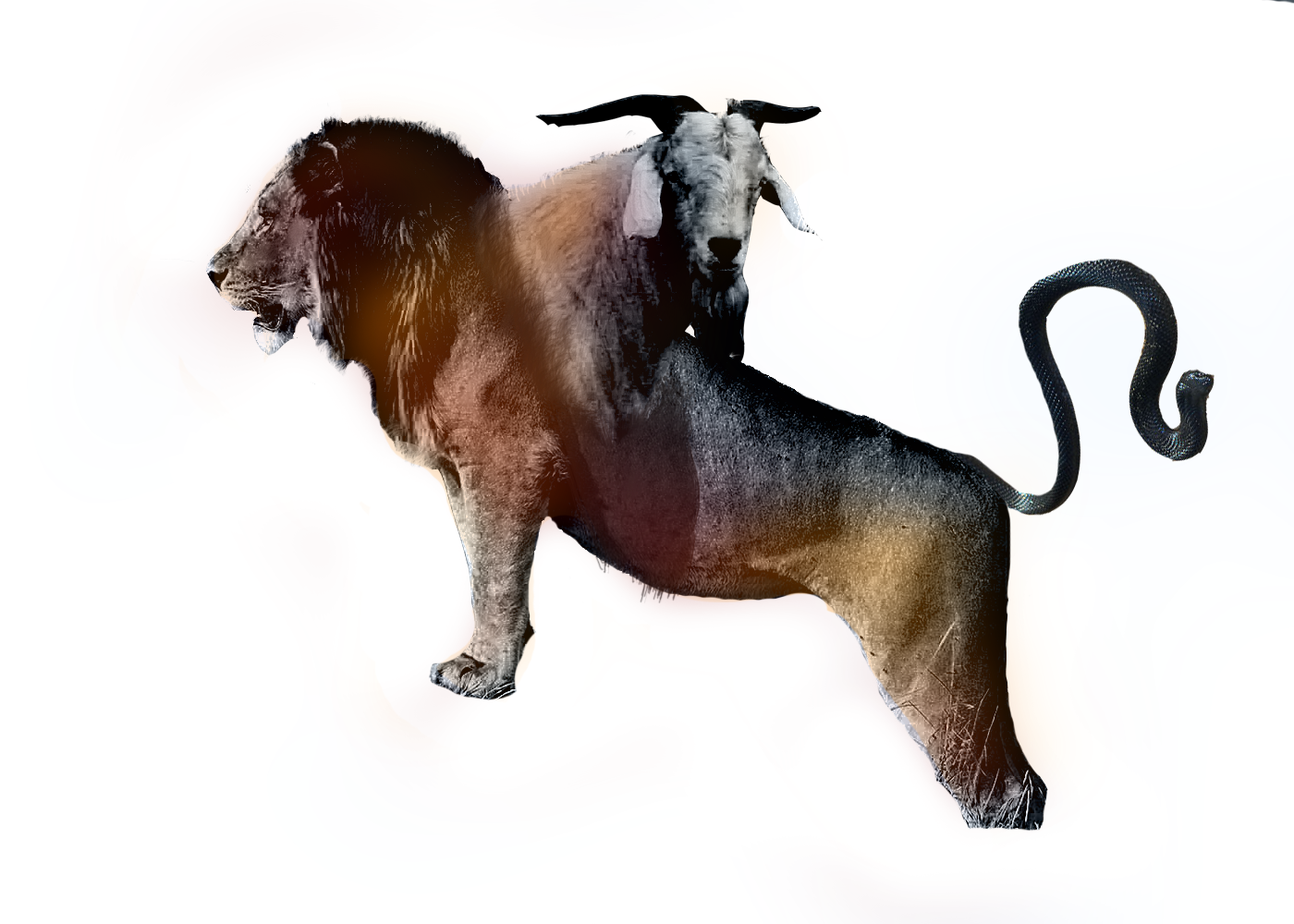
Chimera
This was when I was still deciding what path to choose. I cut out a snake, lion and goat and merged them together like the Chimera. I grey scaled them to make the merging easier (which I could've done another way now) and then coloured it like I did with Mrs. Big Lipped. 

Headless Horseman
I don't like the pixelated flames nor the colour of the background. Infact I hardly even like this photomontage. The background could've been more dramatic.
It's all so copied and pasted. Nothing is alive or real here.

Monsters

Mrs. Big Lipped
This was my second creation. It's rather simple I created this. I enlarged my lips and used a black pen tool to create the eyes, then used my iris and enlarged them. Afterwards used the common trick of duplicating the picture and layering it transparent over the original. Then I added different colours and gaussian blur. 

Zapper
The origin of this one is pretty funny though. I was on a skype call warping faces of Jim Carry and Nicolas cage. I tried to recreate my friends character and out popped this guy. At first we were laughing and then we realized this guy had a fantastic design! 
It's called Zapper because the character it was based off was called Zap.

Wednesday, 30 April 2014

Skin and bones

Skin and bones

The original
I was just practicing morphing the face using the new skill I learnt; Layer Masking and Liquifying. I was watching a tutorial on how to morph an animal face into a person. I didn't like the results, so I looked for inspiration for my new techniques. I found a photo manipulated picture of a woman with a skull jaw, and the universe in her eye. It gave me inspiration. So I inked the red eyes, liquified the cheek bones like a skull and using the mask layer I applied a skulls teeth. This I think shows my improvement. It all looks very real and dynamic. 

 Filtered


 This is my favorite filter. It sort of reminds me of a gorilla that found it's way out of a horror movie and to your front door. It's certainly the scariest of the bunch.

Wednesday, 23 April 2014

Fun

Railroad
This was just a random mess of madness. I tried to create a rail word face inspired by Moppaa's work (see bellow) but unfortunately this is just terrible. Yes it does look weird like the rest, but I clearly didn't know what I was doing. You can see my chin and the railroad was just a bit to clear. I think I could've added a bit more color to it at least. 

Cartoon Me
Using a photograph I turned myself into a cartoon using the smudge tool, but leaving my top just the same. I also added a black line around it like cartoons. I'm pretty pleased with it but at the same time it just looked like a blurred out mess. 

Potato Head
Now this one I really do like. My friends were mesmerized by this piece. I think the quality of the hands could've been better (I didn't know about the mask layer at the time) because they look rather cut and pasted. Despite this flaw the actual face, presentation and design is rather brilliant. It looks so real and disturbing. It is possibly one of the best I ever created but it isn't one of my personal favorites. 

ONE
Now this was a piece I did for fun, and lead me to try more photo manipulated monsters with myself. This is a monster from Pan's Labyrinth. As soon as I saw this monster I fell in love with the concept. It was so imaginative and so creepy. So out of appreciation I manipulated myself to look like him. Despite not knowing the techniques I know now, this actually turned out really nice. Most of this was copying and pasting, then using a soft eraser to smooth it all in. I of course darkened the mouth as well. This is my first piece and still possibly one of my favorites. 

Tuesday, 1 April 2014

Moppaa

I'm completely in love with this DeviantArt artists work and his illustrations for children horror stories. All I know is his job and that he lives in Russia. There is not biographical information on him as of yet but I still love his work. They usually feel like portraits, only disturbing and full of monsters.

He makes these from his own resources and then he manipulates them onto photoshop, creating the most disturbing work imaginable. I love the concept of this photograph. It reminds me of pollution, and perhaps the figure being death. It maybe seeing the whole city, everyone, as horrible people and sinners. I assume this because in the background there is a cross. He looks like he could be drooling a river or train rail lines from his mouth but it's rather unclear. The emotion I feel from this is pure hatred and disturbance. For his technique, I'm guessing he used greyscale (with a tint of color) and a photo of a city as well as a picture of enlarged teeth.

I'd love to pick out another photoshop image of his but I don't think I could. My brain is literally battling itself and screaming at the fact there's to many fantastic works to pick from and write about. 

Link to his DeviantArt account http://moppaa.deviantart.com


Wednesday, 19 March 2014

Albert Fish

This may not look as pleasing as the rest of my pieces, but it was the one that inspired me the most. It gave me the idea to follow the route of Moppaa and photo manipulation. I love the unneat cut out head. It just gives it it's personality. 

Tuesday, 7 January 2014

Manipulating on Photoshop

How to Manipulate photos
  The first thing I do when I open up a photo on Photoshop, is that I change the image size from somewhere bellow 20 centimeters, resolution being 100-300.
 Select Image- Adjustments- Hue and saturations. I adjusted the hue to a blue and green color, whilst also adjusting the darkness.


Here I played around with the filter gallery, creating dramatic and pretty effects. I liked making the dramatic digital paintings because that's one of my favorite thing to do than pretty.


Here is me using the use of the magic wand tool to select pieces of the digital painting I want to erase.

I used the lasso tool to surround the digital painting, and clicked inverse to delete the outside background.

This is the crop tool, which admittedly I don't use much unless I want to get rid of borders.

This is the simple, longer method of erasing with the pen tool. For this digital painting it made sense since I wanted to keep the water, which photoshop mistakes for part of the background when I use wand tool.

Here is an example tonal painting of all the layers. First pick a grey colour to get the none shaded areas of the photo using the wand tool, and colour it on another layer. On two other layers, use black/dark grey for the darker shades and lighter grey for the lighter shades.

This is a digital painting I did of me previously using these techniques used for tonel shading. Personally I'm really proud of this because yes this is my first attempt at tonel shading on photoshop, and I think it turned out pretty well. However I did have issues with the eyes, so I had to digitally paint them with my pen tool, same with the lips. I think I should have painted the top lip black since that's usually where the shading on lips fall, also the right eye is bigger, less careful compared to the left eye.

For this digital painting I got  a Paul Cezanne painting because I was fascinated on the techniques he used for painting. This one I chose especially because I love skulls. All except the sheets and skulls was taken from Google and do not belong to me. I cut around these images and saved them in a tab, using the filter tools to change the effects, trying to get it similar to the painting itself. For the background I just merged different sorts of colours similar to the background.. I also shaded on the skulls to make them look slightly more real. What I'd like to change about this painting however is the distorted skulls. I tried to match the angles and perspectives of the skulls in the painting, which left them looking weird and fake. I'm also unsure of the background because to me it looks a bit plastic in comparison to the one in the painting. However I do think this digital painting is pretty successful and I am proud of the finished product.


Secondary image from Hunterian Museum Archaeology & Ethnography Collections


Secondary image ZBrush Central


Secondary image connecticut valley biological


Over all I'm actually quite pleased with this digital painting. Although it wasn't my first time using photoshop which I use for my personal drawings, this was my first time actually doing anything like this. I've learnt some techniques that I didn't know before. I've enjoyed this part of the course, and I think I've pretty well overall. It was almost a walk in the park.