How to Manipulate photos
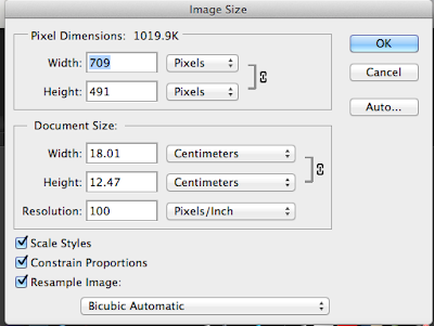
The first thing I do when I open up a photo on Photoshop, is that I change the image size from somewhere bellow 20 centimeters, resolution being 100-300.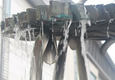
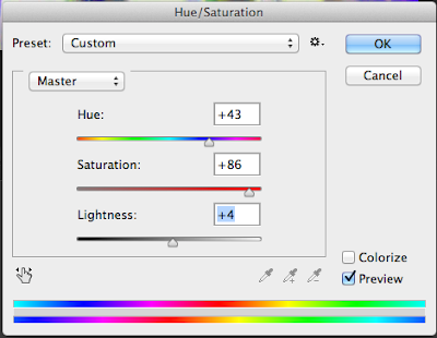
Select Image- Adjustments- Hue and saturations. I adjusted the hue to a blue and green color, whilst also adjusting the darkness.
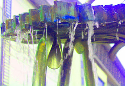
Here I played around with the filter gallery, creating dramatic and pretty effects. I liked making the dramatic digital paintings because that's one of my favorite thing to do than pretty.


Here is me using the use of the magic wand tool to select pieces of the digital painting I want to erase.
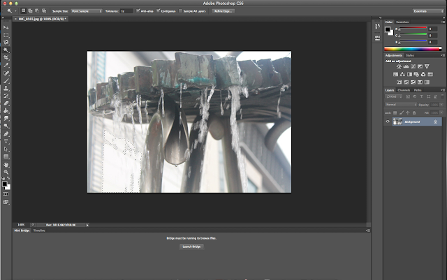
I used the lasso tool to surround the digital painting, and clicked inverse to delete the outside background.
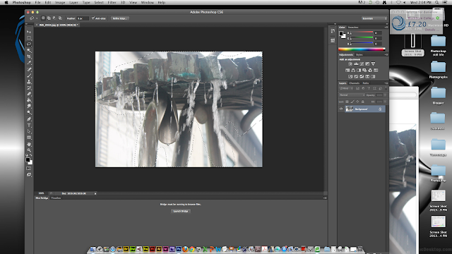
This is the crop tool, which admittedly I don't use much unless I want to get rid of borders.
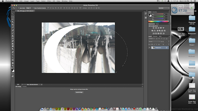
This is the simple, longer method of erasing with the pen tool. For this digital painting it made sense since I wanted to keep the water, which photoshop mistakes for part of the background when I use wand tool.
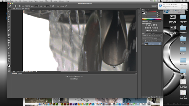
Here is an example tonal painting of all the layers. First pick a grey colour to get the none shaded areas of the photo using the wand tool, and colour it on another layer. On two other layers, use black/dark grey for the darker shades and lighter grey for the lighter shades.
This is a digital painting I did of me previously using these techniques used for tonel shading. Personally I'm really proud of this because yes this is my first attempt at tonel shading on photoshop, and I think it turned out pretty well. However I did have issues with the eyes, so I had to digitally paint them with my pen tool, same with the lips. I think I should have painted the top lip black since that's usually where the shading on lips fall, also the right eye is bigger, less careful compared to the left eye.
For this digital painting I got a Paul Cezanne painting because I was fascinated on the techniques he used for painting. This one I chose especially because I love skulls. All except the sheets and skulls was taken from Google and do not belong to me. I cut around these images and saved them in a tab, using the filter tools to change the effects, trying to get it similar to the painting itself. For the background I just merged different sorts of colours similar to the background.. I also shaded on the skulls to make them look slightly more real. What I'd like to change about this painting however is the distorted skulls. I tried to match the angles and perspectives of the skulls in the painting, which left them looking weird and fake. I'm also unsure of the background because to me it looks a bit plastic in comparison to the one in the painting. However I do think this digital painting is pretty successful and I am proud of the finished product.
Secondary image from Hunterian Museum Archaeology & Ethnography Collections
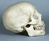 Secondary image ZBrush Central
 Over all I'm actually quite pleased with this digital painting. Although it wasn't my first time using photoshop which I use for my personal drawings, this was my first time actually doing anything like this. I've learnt some techniques that I didn't know before. I've enjoyed this part of the course, and I think I've pretty well overall. It was almost a walk in the park.


No comments:
Post a Comment